Overview
The Coffee House Collective is a concept brand built around a simple idea: blending coffee culture with music culture. Inspired by daytime DJ sets in café spaces, the identity needed to feel warm, social and rhythm-driven, while still working as a clean, scalable brand across physical and digital touchpoints.
The Challenge
Create a brand that captures two distinct worlds without leaning too heavily into either. Coffee brands often feel slow and minimal. Music brands tend to be high energy and loud. The challenge was to find a middle ground that felt relaxed but still full of personality, something that could live comfortably in a café setting while nodding to DJ culture.
The identity also needed to work across a wide range of applications, from signage and packaging to social content and event promotion.
The Approach
The direction focused on building a visual language that merges both worlds in a subtle, cohesive way. Rather than forcing obvious music references, the concept leans into shared characteristics between coffee and music: rhythm, flow and repetition.
This led to a system built around:
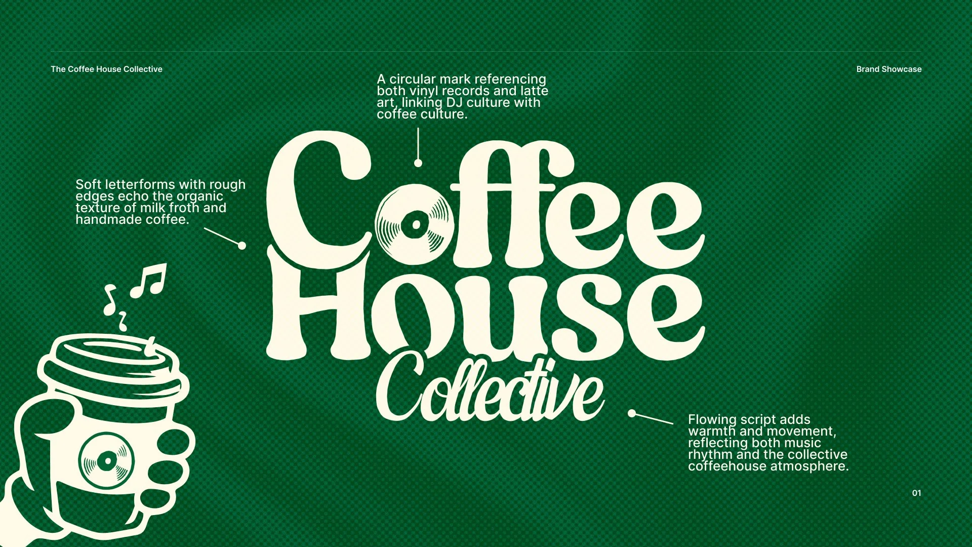
Circular forms inspired by vinyl records and latte art
Hand-drawn textures to reflect the organic nature of coffee
Rhythm-driven iconography influenced by DJ culture
The result is a brand that feels expressive, but still grounded and approachable.
Identity Design
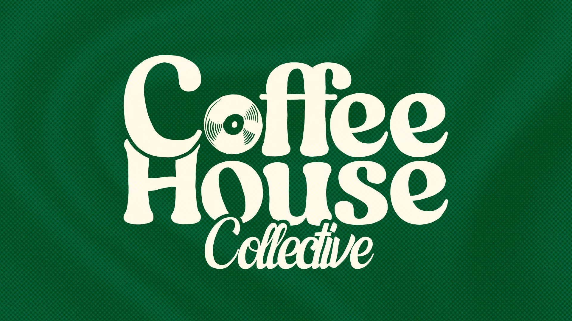
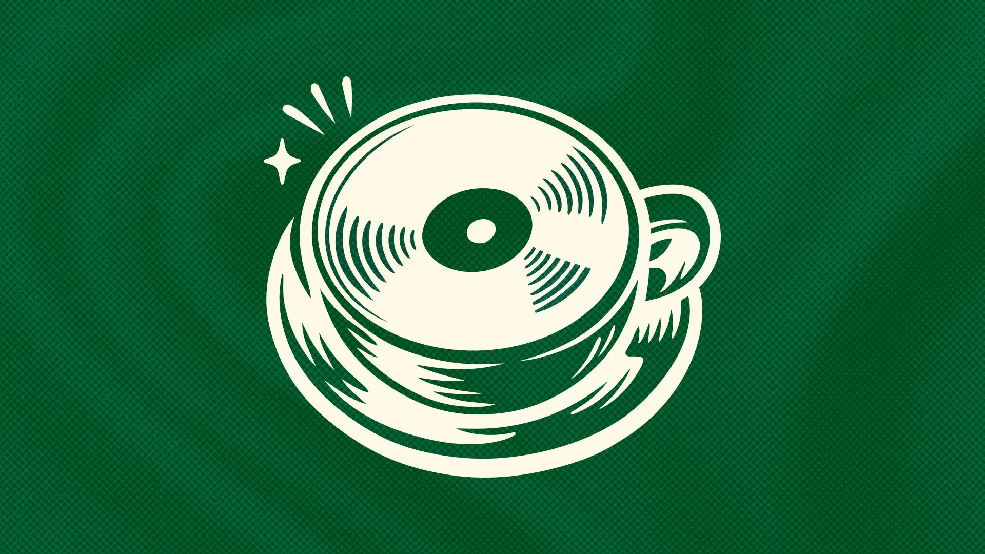
The logo combines soft, characterful letterforms with a flowing script to introduce movement and warmth. The circular “O” mark acts as a key brand device, referencing both a vinyl record and the surface of a coffee. This creates a subtle link between the two worlds without overcomplicating the design. The supporting script adds contrast and energy, bringing a sense of flow that ties back to both music rhythm and the social atmosphere of a coffee space.
Visual Language
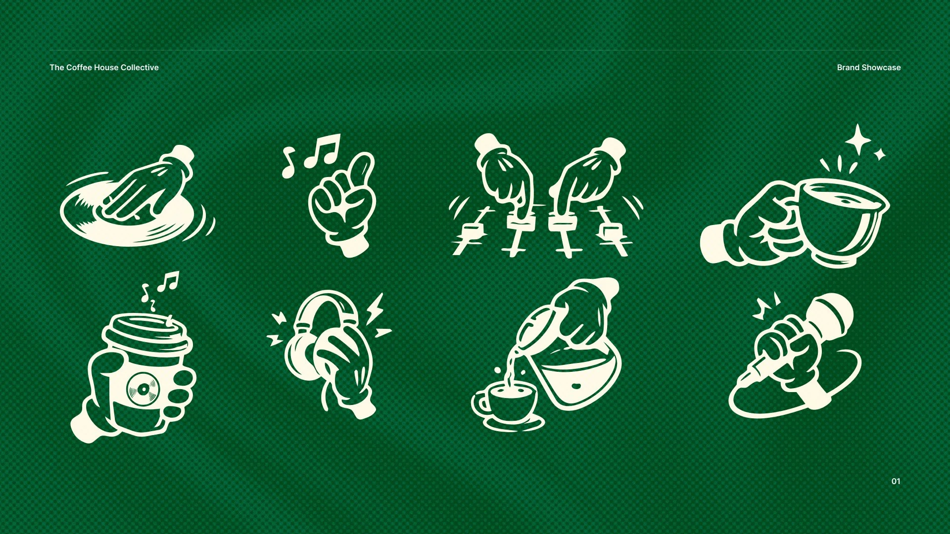
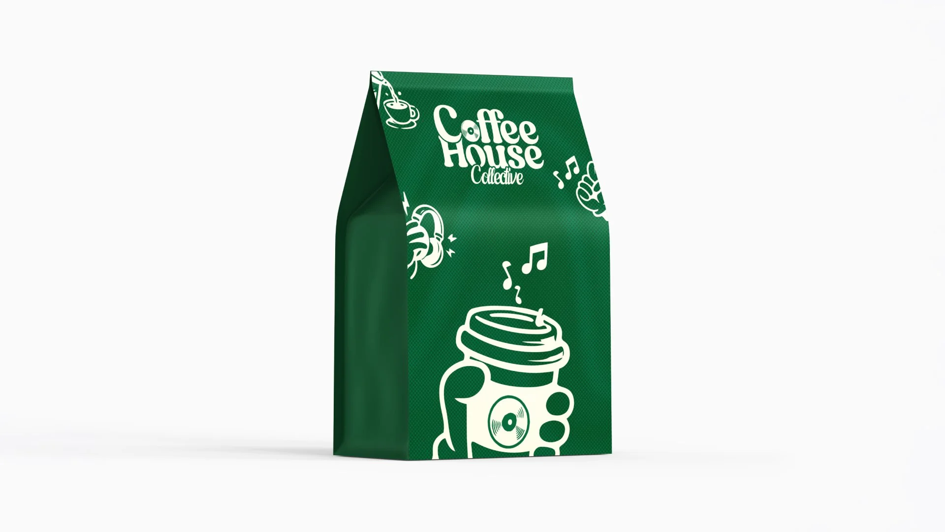
A custom set of illustrated icons extends the identity and gives it flexibility across different touchpoints.
These include:
Hands interacting with coffee and DJ equipment
Sound-inspired elements like musical notes and motion lines
Repetitive, loopable forms that reinforce rhythm and movement
The illustration style keeps things playful and human, avoiding anything too polished or corporate.
Colour & Tone
A deep green palette anchors the brand, giving it a distinct and memorable base that feels both premium and grounded. Paired with warm, off-white tones, the colour system reflects the balance between energy and comfort, echoing the idea of music in a relaxed café environment.

Application
The identity was designed to scale easily across multiple formats.
It translates consistently across:
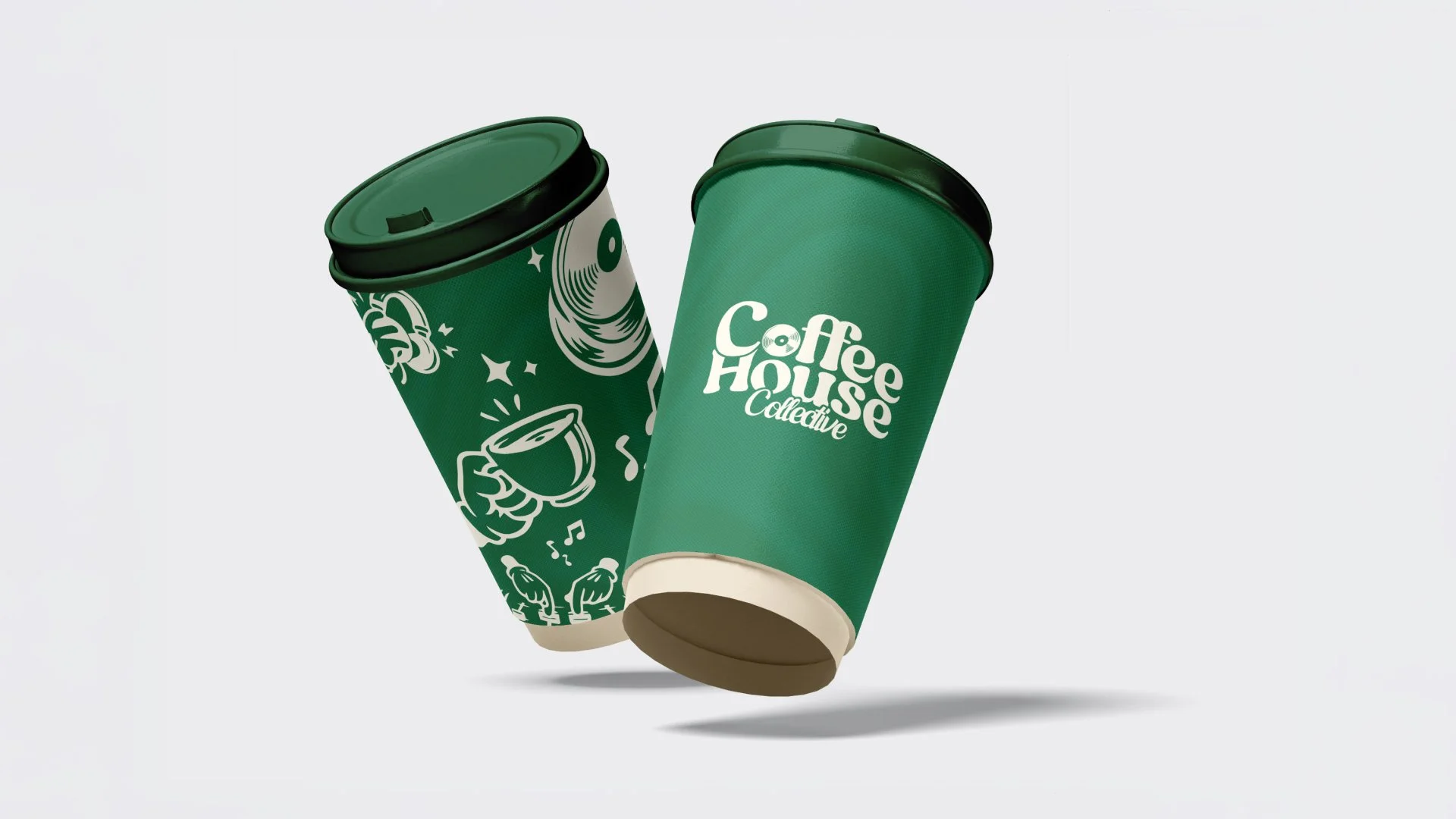
Packaging and takeaway cups
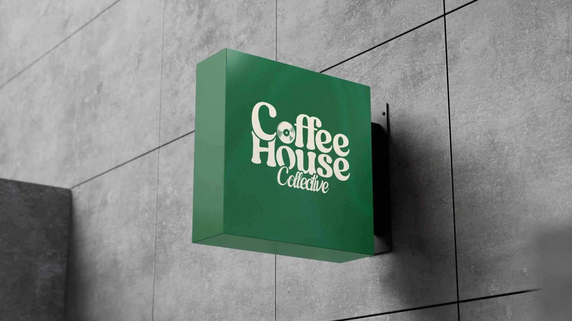
Exterior signage
Merchandise and print
Social and digital assets
The flexible icon system allows for variation without losing consistency, helping the brand feel dynamic across different outputs.
Outcome
The final identity captures the crossover between coffee and music in a way that feels natural rather than forced.
It creates a recognisable, character-led brand that could easily extend into real-world events, social content or a physical space. The system is simple enough to be scalable, but rich enough to stay interesting across repeated use.